
Hue Focus: Marsala is Pantone's Color of Choice for 2015
Pantone Inc., the oracle of colors, has recently crowned Marsala as the Color of the Year for 2015. Since color - just like everything else - is highly subjective, the unveiling was dealt with both negative and positive reviews.
Pantone describes the color as “much like the fortified wine that gives Marsala its name, this tasteful hue embodies the satisfying richness of a fulfilling meal, while its grounding red-brown roots emanate a sophisticated, natural earthiness. This hearty, yet stylish tone is universally appealing and translates easily to fashion, beauty, industrial design, home furnishings and interiors." And what does it do for interior design?
According to Pantone’s press release, “Complex and full-bodied without overpowering, Marsala provides a unifying element for interior spaces. Add elegance to any room by incorporating this rich and welcoming hue in accent pieces, accessories and paint. Marsala's plush characteristics are enhanced when the color is applied to textured surfaces, making it an ideal choice for rugs and upholstered living room furniture. Nurturing and fulfilling, Marsala is a natural fit for the kitchen and dining room – making it ideal for tabletop, small appliances and linens throughout the home. The hue will be especially prominent in striping and floral patterns found in printed placemats, dinnerware, bedding and throws.”
Summary: use it in moderation during incorporation. Our humble take? We bloody (mattified) love Pantone’s choice for 2015! We think that it’s better than 2014’s Radiant Orchid. For one, the shade is leaning towards the side of adaptability. It might not be a neutral per se, but it can be easily harmonious when it comes to color combinations. Secondly, unlike Radiant Orchid, Marsala is agamous - it can be used as a wall color inside a lady’s loft or a man cave's. Here are a few Marsala interior inspirations for you to try:

Accent Wall
A fairly rich color such as Marsala can be a beautiful surprise in a monotone achromatic room. A space can be easily defined by creating an accent wall in this hue; above the fireplace is one way to use it in minimal dose yet create a striking effect that’s subtle and elegant. What’s great about this color is that it can accentuate the room without being intense; sort of like a stealth power.


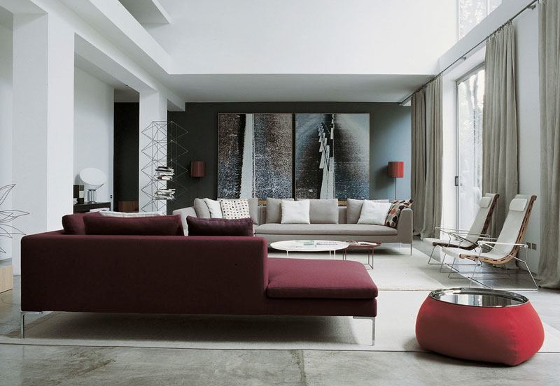
Transient Piece
If you love Pantone’s Color of the Year for 2015, but can’t go as far as painting your wall, add a transient piece such as sofa or lounge chairs! A dose of Marsala in a neutral room can immediately make the space visually appealing, and less stark. Decorative pillows, vase, bowls, rugs, and lamps are just some of the pieces you can start with as well.

Kitchen
A Marsala overkill inside your kitchen is a definite don’t. We, however, love large doses such as horizontal kitchen cabinet, island, and backsplash. A vintage dish cabinet in this color can be quite a statement, too! Another thing to swoon about this color is the fact that it has a strong staying power. It’s fairly safe to incorporate it perpetually inside your home. Just like what Pantone suggested, you can conservatively Marsalify your kitchen through small appliances and other kitchen accessories.

source
Bedroom
The bedroom is the easiest area of the home to incorporate any design or color to. In terms of adding in a good quantity of Marsala to a bedroom, it can easily be done by changing your beddings or curtains. Hanging artworks with a hint of this hue will create a good impact, too. The color is subdued enough to not take the distraction away from the rest of your room. It works great with black, white, tan, beige, and gray.